YouTube Channel explains El Niño.
The new El Niño YouTube playlist is a resource including explanations of the predictability of El Niño, the 2014 El Niño that never materialized and the 2015-2016 El Niño that challenges the 1997-1998 El Niño for the largest on record
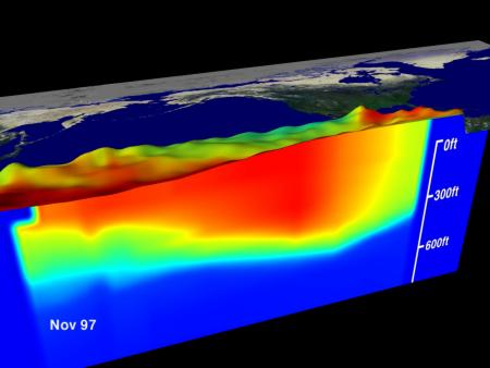
Learn how and why PMEL developed the El Niño observing system in the tropical Pacific, which includes a narrated animation of the evolution of the 1997-1998 El Niño, the largest on record at the time. You can also view a YouTube animation of the evolution of the 2009-2010 El Niño, which shows the strongest "Central Pacific" El Niño in the past 3 decades, with maximum warming in the central equatorial Pacific (vs the classic El Niño, like 1997-1998, with maximum warming in the eastern equatorial Pacific).
El Niño animations show changes in sea surface temperature in the tropical Pacific Ocean. As you view them, you will see the warm water spreading from the western Pacific to the eastern Pacific as the El Niño evolves. The bottom panel in the animations, labeled anomalies, shows temperature deviations from normal (how much the sea surface temperature is different from the long term average). The red color in the anomalies plot indicates that the temperature of the water is much warmer than is normal for that month, whereas blue color indicates that the water is much cooler than is normal. Animations of physical processes allow scientists to better understand the El Niño cycle.