Hi Hussen,
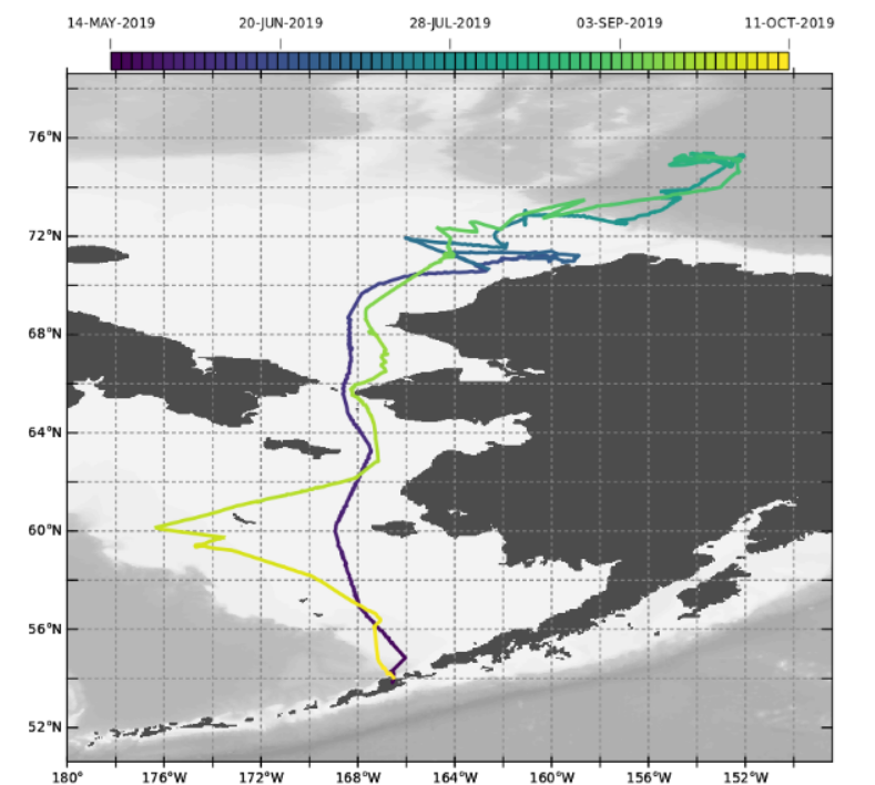
This is not a native capability of PyFerret. However there is a script that is used for plots which color track data according to time, so that a dataset which represents a set of ship tracks or other trajectory data can be plotted, showing time along the tracks. Here is a screenshot showing such a plot.
The script that is called to make the labeled colorbar for this plot is "colorbar_datekey.jnl" and it is included in the PyFerret distribution. With a little work it can be used for a SHADE or FILL plot that shows time. Here is an example
yes? go/help color_datekey ! see the details about calling color_datekey.jnl
...
(The examples at the start of the script could be run using the trajectory dataset currently included in the Ferret Datasets distribution, dsg_trajectory_example.nc. In that dataset the time coordinate variable is named "time".)
The color_datekey.jnl script assumes we are using DSG dataset, so a little more set-up is needed before it can be used with a 2-D variable.
We need to specify a 1-dimensional time variable in calling color_datekey.jnl. This is a 1-dimensional list of the time data being plotted. The time variable needs to have a units attribute which is of the form "units since start-date", for instance "days since 1-jan-2020". In a dsg file, the time coordinate variable has an attribute called time_origin, so we also need to define that attribute. Finally, the comments at the start of color_datekey says the script may only be called when drawing an overlay plot.
Here is an example that I was able to create:
! Define a 2-dimensional variable just for this example, with units of
! time in "days since 1-jan-2020". You will use your time variable, with
! its units defined using this form, and the units and origin from your data.
DEFINE AXIS/X=20:30:0.5/UNITS=degrees_east xaxis
DEFINE AXIS/Y=-10:10:0.5/UNITS=degrees_north yaxis
LET/UNITS="days since 1-jan-2020" my_time = 10*RANDU(i[gx=xaxis]) + 15*RANDU(j[gy=yaxis])
! Define a viewport which leaves extra space to the right of the plot for the date labels
DEFINE VIEWPORT/X=0:0.8/Y=0:1 xyview
SET VIEW xyview
! Define the 1-dimensonal list of time data to send to the color_datekey.jnl script.
! Define the time_origin attribute.
LET/UNITS="days since 1-jan-2020" time_list = TSEQUENCE(my_time)
DEFINE ATTRIBUTE time_list.time_origin = "01-jan-2020"
! Draw the 2-dimensional plot. This will be the underlay plot. We will re-draw it
SHADE/NOKEY my_time
! with the /overlay qualifier when making the date-labeled color key.
! Now re-draw using /OVERLAY/SET and call the color_datekey script
SHADE/OVER/KEY/SET my_time
GO color_datekey "v" time_list
PPL SHADE/OVER
Either SHADE or FILL will work.
Ansley
On 12/6/2021 10:49 AM, Hussen Seid wrote:
Dear Ferreters,
I have a netcdf file containing the rainfall onset dates for a specific rainfall season. The onset dates are calculated using a different tool. I would like to produce the spatial maps of the onset dates in pyferret (similar to the attached map), but am having difficulties in labeling the dates in the legend.
Does anyone know how this is done?
Thanks in advanceHussen........................................................................................................................
Hussen Seid Endris (PhD)
CLIMATE MODELING EXPERT
IGAD Climate Prediction and Applications Centre (ICPAC)
Ngong Town Kibiko A Road, Near KIHBT
P.O.Box 10304-00100, Nairobi, Kenya
T: +254 792 532 851 Skype: hussen.seid1_1
Follow us on Facebook | Twitter | Youtube | Website
........................................................................................................................