I just saw that your question from last week was not answered. The algorithm for fill plots interpolates between the data at the coordinate locations on the axis. It cannot go beyond the first and last coordinates, which for your data are at the centers of each month.
Here is another message from earlier this year, which talks about a similar question :
http://www.ferret.noaa.gov/Ferret/Mail_Archives/fu_2005/msg00156.html
Try the SHADE command and compare the resulting plots; SHADE fills in the whole of each grid box with the color corresponding to the value at the grid box center.
So, how to extend the data to the start of January and the end of December? Ferret does not have a way to extrapolate all the way to the beyond the coordinates to the axis boundaries on each end. This depends on the data and how you think it might best be extended. One might think of defining a 14-point time axis, repeating the data from January in December 2002, and the December 2003 data in January of 2004. Then you could do this:
FILL/hlim=1-jan-2002:31-dec-1982 var
This may not be a satisfactory answer for your data and what it represents. Other ideas, anyone?
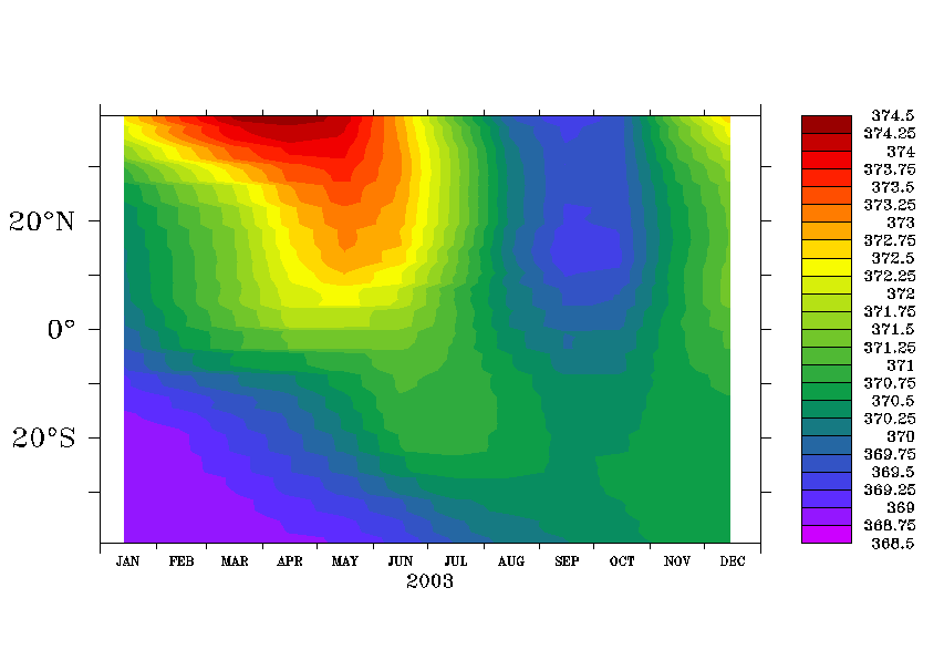
Yogesh K. Tiwari wrote:
Hello Ferret Users,
I am making a time series adding the 12 files and using the following time axis definition :
define axis/t=1:12:1/t0=15-dec-2002/unit=months tax
The time series plot has the white portion before Jan month and after Dec month. I have to produce the plot which I can sent for the journal publication.
Can any one help me that how I can take out this extra white portion OR can make better this plot.
The plot is attched here.
Thanks,
Regards,
Yogesh