Inflation Threshold Forecasts - Method #2 (last 1 month)
This is a second alternative method of forecasting the time when Axial Seamount will reach the inflation level before the 2015 eruption started. We found that Forecasting - Method #1 was quite "noisy" because the de-tided BPR depths include tidal residuals and oceanographic effects in addition to the geophysical signals we are interested in. In contrast, this Forecasting - Method #2 subtracts the de-tided depths from BPR MJ03E (Eastern Caldera, which has the smallest inflation signals) from BPR MJ03F (Central Caldera, which has the largest inflation signals), and uses the DEPTH DIFFERENCES between the two to calculate a differential inflation rate for the last 4 weeks. This removes the tidal residuals and oceanographic effects that are common to both stations. Method #2 calculates the differential inflation rate for the last 4-weeks and uses it to extrapolate into the future to when the differential level of inflation will reach: (1) the level when the 2015 eruption started, and (2) a level 20 cm higher than in 2015 (which is somewhat arbitrary, but is included because the level of inflation in 2015 was higher than the level reached before the 2011 eruption). These plots are updated once a day using the latest data from the OOI Cabled Array. In contrast, Forecasting - Method #3 calculates the differential inflation rate for the last 12-weeks to extrapolate into the future.
Note: the rate of inflation is variable and so the forecast dates will also vary with time. The histogram plot below shows the dates where most of the forecasts have fallen. When the 4-week inflation rate gets very low, forecasts are suspended until the rate returns to higher levels. Of course, we do not know at exactly what level of inflation the next eruption at Axial will be triggered, but our best guess is that it will be within a year after the 2015 inflation threshold is reached. We will likely make a more specific forecast when we get closer to that threshold on our Axial Seamount Eruption Forecast Blog. Programming by Andy Lau, Oregon State University.
LINK BACK TO MAIN PAGE
Rate of Differential Uplift (MJ03E-MJ03F), last 3 months
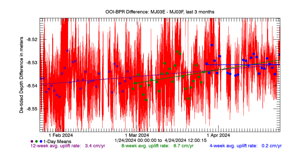
Plot of Differential Uplift between the BPRs at the Eastern Caldera (MJ03E) and Central Caldera (MJ03F) sites for the last 3 months. Rates of Differential Uplift are calculated for the last 4-, 8-, and 12-weeks. The 4-week rate is used in the forecasts below.
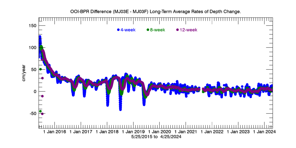
Plot of how the 4-week (blue) and 8-week (green) average Rates of Differential Uplift have varied over time, since 25 May 2015.
Inflation Threshold Forecasts using Differential Uplift Rate (last 1 month)
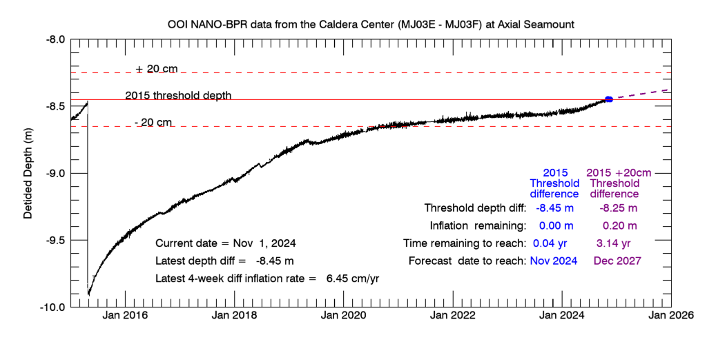
Plot of differential inflation from the Eastern Caldera BPR (MJ03E) minus the Central Caldera BPR (MJ03F) as the black curve showing deflation during the 2015 eruption (left) followed by re-inflation. If the rate is positive, a blue dashed line extrapolates into the future using the average rate of differential inflation from the last 4 weeks; middle blue dot is date when 2015 inflation threshold is reached, right purple dot is when a threshold 20 cm higher will be reached. See plot legend. Click for a larger version this plot.
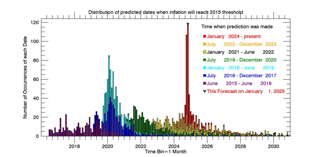
Histogram of predicted dates when Axial Seamount will reach the 2015 differential inflation threshold, color coded by when the predicted date was calculated. Predicted dates were calculated based on the average rate of differential inflation from the previous 4-weeks, beginning in June 2015. Predicted dates are binned in months. Click for a larger version this plot.
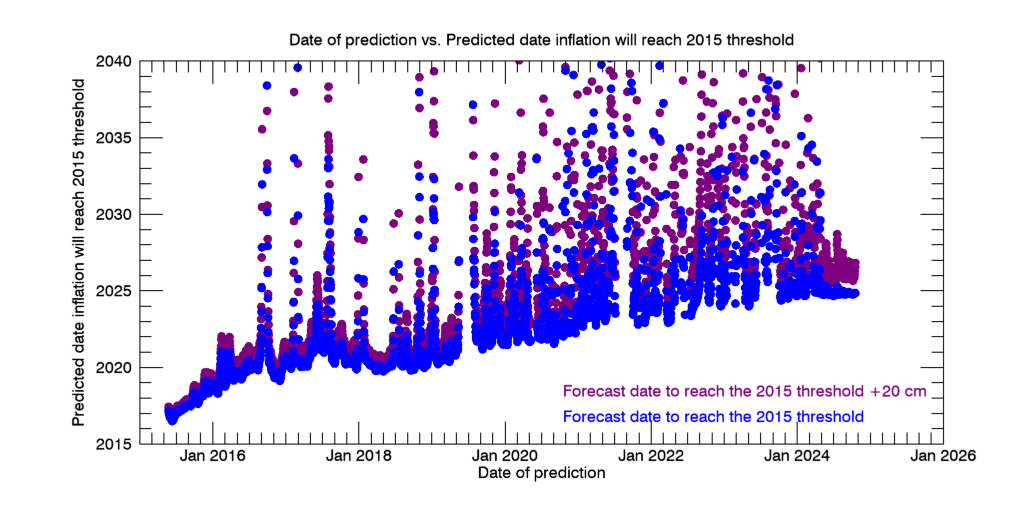
Plot of Predicted date that differential inflation will reach the 2015 inflation threshold (Y-axis) vs. Date on which the prediction was made (X-axis), using the average rate of differential inflation from the previous 4 weeks, starting in June 2015. Blue dots are date to reach the 2015 inflation threshold; purple dots are for a threshold 20 cm higher (as in the first plot above). Note predicted dates were earliest when the rate of re-inflation was highest, soon after the 2015 eruption (left side of plot). Peaks in the curves show time periods when the average rate of inflation slowed significantly (especially in mid-2017 and mid-2018), which pushed the predicted dates farther into the future. Click for a larger version this plot.
More information
National Science Foundation | The Ocean Observatories Initiative | Cabled Array Observatory
Required OOI disclaimer: This is provided as pre-commissioned data intended for scientific use, and is subject to the OOI Data Policy. This data has not been through Quality Assurance checks.
Required NSF disclaimer: This material is based upon work supported by the National Science Foundation. Any opinions, findings, and conclusions or recommendations expressed in this material are those of the author(s) and do not necessarily reflect the views of the National Science Foundation.