|
Hi,
The PLOT command that is used to make the plot could be modified
with a PLOT/VLIMITS=, and other histograms added with overlays.
When the script runs, it gives you some coaching about modifying the
look of the plot, so that's where it would go.
You may want to replot with color qualifiers on PLOT and
Ymin specified:
>>> go bar_chart2 plot/line wt_count[d=frequency_h.dat]
y clear [Ymin]
The frequency_histogram script writes out a file with the data
computed; frequency_h.dat, with the "wt_count" variable, and then
reads that back in. You could rename this file after running the
script for your first dataset, run frequency_histogram again to
compute the weights for the second variable but the same set of bins
and then plot them together.
Here's a quick example based on the example at the start of
frequency_histogram.jnl. It runs the script on two different
regions, looks at the y-axis range that each plot command uses.
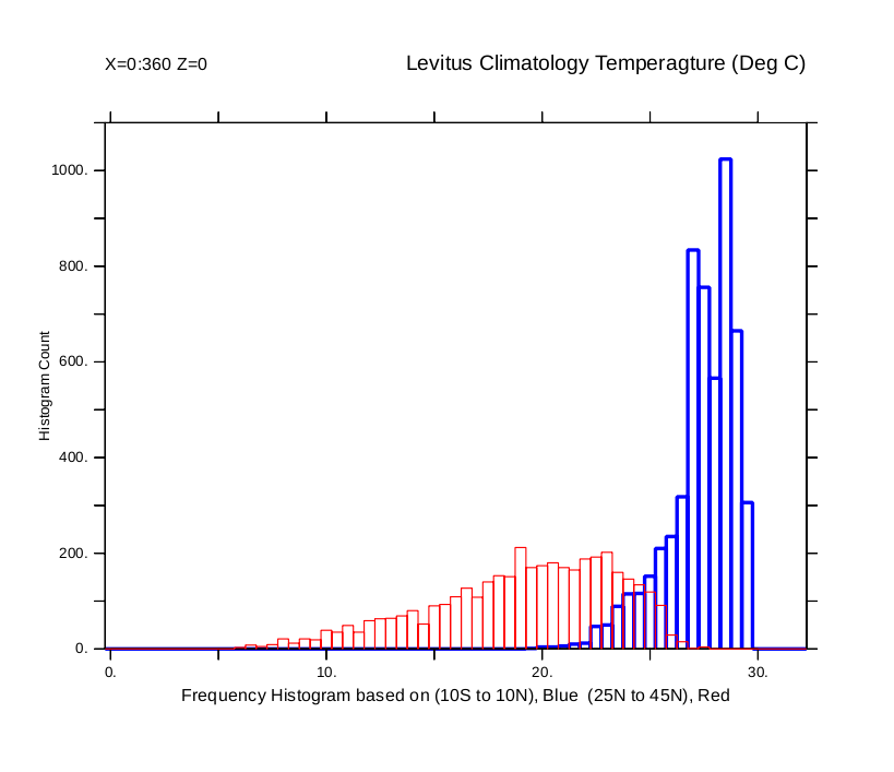
yes? SET DATA levitus_climatology
yes? GO frequency_histogram temp[X=0:360,Y=25:45N,Z=0] 0
32 0.5 " " y 0
yes? show symbol yaxis*
YAXIS_MIN = "0.000000"
YAXIS_MAX = "220.0000"
yes? cancel data/all
yes? sp mv frequency_h.dat frequency_h_45.dat
yes? SET DATA levitus_climatology
yes? GO frequency_histogram temp[X=0:360,Y=-10:10,Z=0] 0
32 0.5 " " y 0
yes? show symbol yaxis*
YAXIS_MIN = "0.000000"
YAXIS_MAX = "1100.000"
! Now open the two files and plot the two histograms; the first
with a thick blue line,
! and a vertical range based on the larger of the two ranges, and
the second with a thin red line
yes? cancel data/all
yes? file/grid=gindex/var="-,wt_count" frequency_h_eq.dat
yes? go bar_chart2 plot/nolab/line/color=blue/thick=3/vlim=0:1100
wt_count[d=frequency_h_eq.dat] y clear
yes? cancel data/all
yes? file/grid=gindex/var="-,wt_count" frequency_h_45.dat
yes? go bar_chart2 plot/line/over/nolab/color=red
wt_count[d=frequency_h_45.dat] y clear
! Add some annotations
yes? annotate/norm/xpos=-0.08/siz=0.1/ypos=0.5/halign=0/angle=90
"Histogram Count"
yes? annotate/norm/xpos=0.5/ypos=-0.1/siz=0.12/halign=0 "Frequency
Histogram based on (10S to 10N), Blue (0 to 45N), Red"
yes? annotate/norm/xpos=1/ypos=1.1/siz=0.14/halign=1 "Levitus
Climatology Temperagture (Deg C)"
yes? annotate/norm/xpos=0/ypos=1.1/siz=0.12/halign=-1 "X=0:360
Z=0"
On 10/19/2017 9:39 PM, Venu wrote:
Hi,
I have been looking at the frequency_histogram
function and see that it plots single variable per a plot. I
am interested to know, how can we plot multiple variables of
same range in a single histogram plot, so that to compare
those variables frequency.
|