Hello,
I am loading different observational data sets that contain many bad
values to plot onto model output. I use
go polygon polymark myvar circle 1.0
for this. This works well: only the good values are plotted. I want a
line around the circles, so I can use the /line option. However, then
I get open circles for both good and bad data. That I do not want.
So I do this:
go polygon polymark/over/pal=black myvar circle 1.0
go polygon polymark/over/pal=rainbow3 myvar circle 0.8
This works, except for the problem that when plotting previous lines
in the plot disappear. Firstly, if the circles are plotted close to the
axes lines, some of the axes lines are removed (as they are underlying
the closed circles). Secondly, circles close to each other remove the
lines of the previous circles, resulting in lump of lineless circles
where observations are dense.
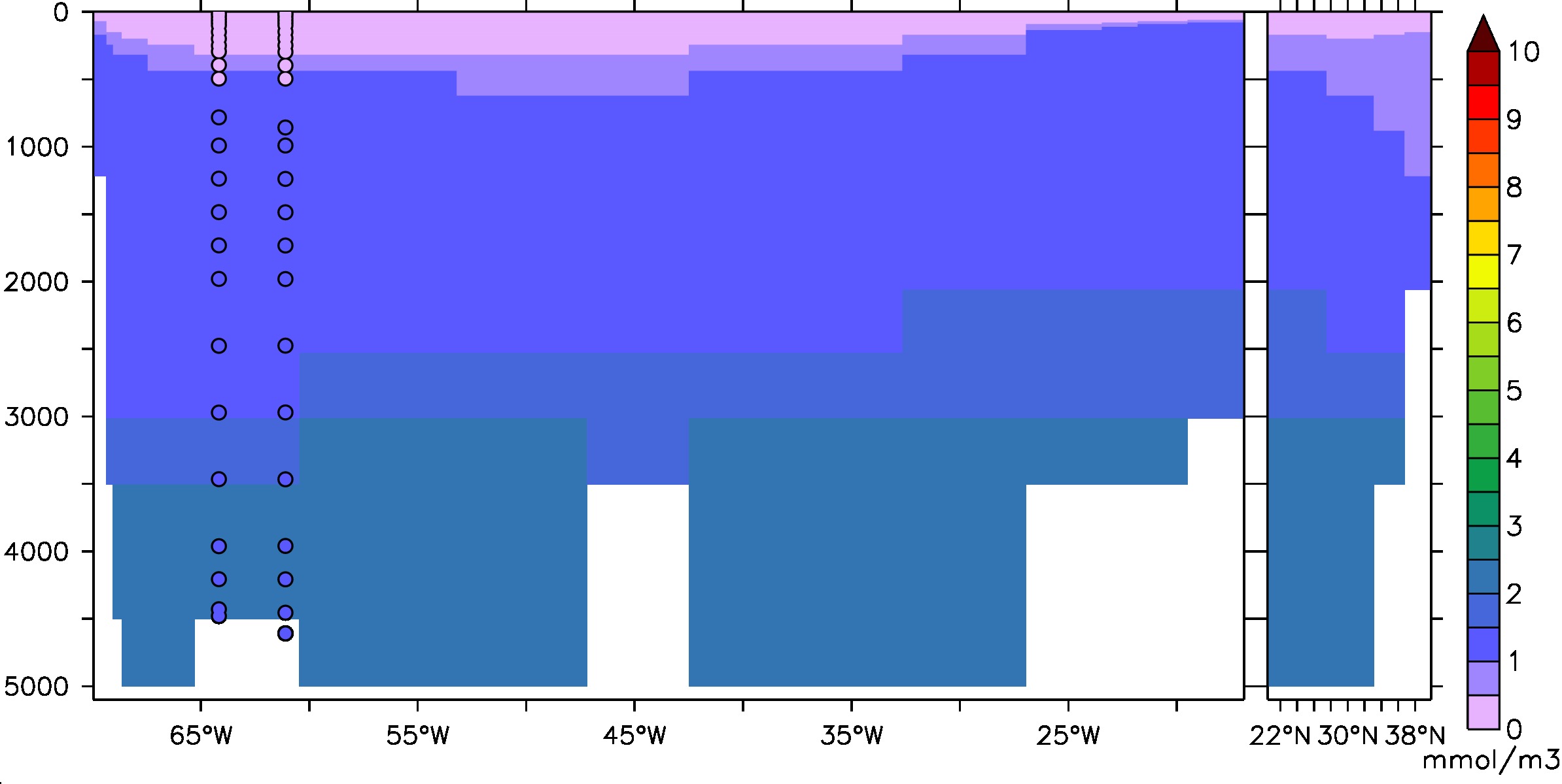
The enclosed figure illustrates these problems. (It shows some
phosphate data of the GEOTRACES GA02 transect overlayed in PO4 section
from the model PISCES-v2 interpolated from the ORCA2 grid onto the GA03
transect, using the rainbow3 palette that I sent in a previous e-mail.)
If there is no simple solution, would you say this is esthetically
acceptable?
Marco
--
Laboratoire des Sciences du Climat et l'Environnement (LSCE)
Tel: +33 1 6908 3876
Www: http://www.lsce.ipsl.fr/Pisp/marco.van-hulten/
Attachment:
PO4_GA03.jpeg
Description: JPEG image