Writing back now to the List as well.
It is the data values themselves which cross from 360 to 0, not the coordinate axis as I thought when I first answered.
Thank you for the pictures and the data. I don't know that any interpolation method would work well on this data field, with the abrupt change from low to high values. If it is to make smooth contours then it will do the kind of thing it is doing now, filling in something like 20 color values along the discontinuity, but here you probably don't want to fill across that gap.
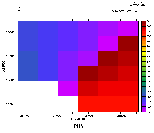
The data values are these, changing abruptly from values under near 0 to values near 360. First make a shade plot to see what we're looking at.
yes? list pha
VARIABLE : PHA
FILENAME : M2P_test.nc
SUBSET : 6 by 6 points (LONGITUDE-LATITUDE)
Z : 1
T : 2
121.63E121.75E121.88E122E 122.13E122.25E
1 2 3 4 5 6
25.63N / 6: 53.1 46.0 36.3 26.5 13.9 2.0
25.5N / 5: 57.9 49.1 34.8 21.0 3.9 350.1
25.38N / 4: 63.2 48.3 27.7 10.2 353.3 340.7
25.25N / 3: 66.6 47.7 22.9 357.2 341.9 331.6
25.13N / 2: .... .... 8.3 337.0 326.9 321.6
25N / 1: .... .... .... 314.1 317.5 317.9
yes? shade pha
yes? ! and here is the FILL plot.
yes? fill pha
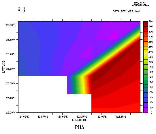
The data in fact does change as shown in the plot, but for this data we don't want to be interpolating between 0 and 360. One workaround is to define two variables, one on each side of the break at 360.
yes? let/units="`pha,return=units`"/title="`pha,return=title`" pha1 = if pha lt 70 then pha
yes? fill/lev=(0,360,10) pha1
yes? let/units="`pha,return=units`"/title="`pha,return=title`" pha2 = if pha gt 300 then pha
yes? fill/over/nolab/lev pha2
On a plot over a larger area, the blank white portion would not look quite so large. Putting a SHADE plot underneath the FILL is another way to handle this, so
yes? fill pha
yes? fill/over/nolab/lev pha1
yes? fill/over/nolab/lev pha2
Ansley
On 10/15/2010 5:49 PM, Yu, Hao-Cheng wrote:
Hi Ansley,
Thanks for your suggestion.
I use "shade" to plot the figure which didn't shows such interpolation error.
Please see the attachment gif (M2P_cross3.gif).
I also attach the data netcdf file.
If I try to use "contour", the result shows like M2P_cross4.gif, there are lots of contour lines between the region across 0(360) degree.
Regards, dan
2010/10/16 Ansley Manke <Ansley.B.Manke@xxxxxxxx>
Hi -
Thank you for the image. The cancel axis/modulo does not have anything to do with this, so you can remove that from your script. My first suggestion is to look at the data with a SHADE plot. It looks like there is a strong gradient in the data and I wonder if that is causing the fill algorithm to have problems. We might be able to improve the result of the fill with the right choice of color levels.
Ansley
On 10/14/2010 10:31 PM, Yu, Hao-Cheng wrote:Hi Ansley,
I attach a gif file which meet the region cross 0 degree.However, I use "fill" not "contour".And I use the following script:
fill/l=2/tit="M2 Phase"/set phago remove_logogo unlabel 3go unlabel 4go unlabel 5go unlabel 6go unlabel 7go margins 0.2 " " " " " "cancel axis/modulo `pha,return=xaxis`ppl fill
pha is a 2D variable contains global M2 phase data.
The figure seems still contain some error interpolations.Could you show me how to avoid this?
Regards, dan
2010/10/15 Ansley Manke <Ansley.B.Manke@xxxxxxxx>
Hi Dan,
If you do not want Ferret to treat a longitude axis as a modulo axis, you can remove the modulo property from the axis
yes? cancel axis/modulo `var,return=xaxis`
If this doesn't answer your question, perhaps you could send an image showing the contour lines that you do not want, and we can figure out what is happening.
Ansley
On 10/13/2010 9:15 PM, Yu, Hao-Cheng wrote:
Dear ferret users,
I try to plot co-range chart with global tide data.
I notice ferret interpolated the values when the degree values across 360 (or 0).
For example, the region between 5 and 355, ferret will interpolate to 180. (Should be 0)
This will cause lots of contour line in this region, and give wrong interpolation values.
Is there anyone do such interpolation and avoid error like this?
Sincerely, dan