I think you could do this pretty easily using viewports. Draw the map in a big viewport covering the entire page, and then make the bar charts in smaller viewports.
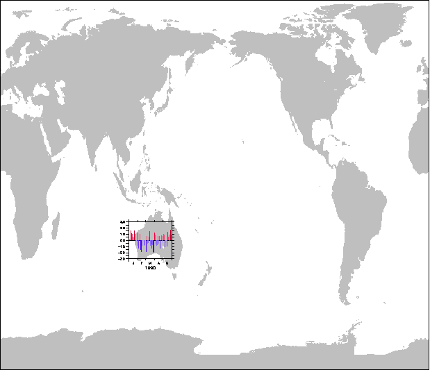
Viewports can overlay each other, and you have control over exactly where they are if you define custom ones, and use the /AXES qualifier. Try this simple example, where I just stick the example plot from bar_chart3.jnl on a global map, more or less over Australia.
yes? define view/axes/x=0.:1/y=0:1 bigview
yes? set view bigview
yes? use etopo20
yes? shade/x=0:360/y=-85:85/lev=(0,10000,10000)/pal=gray_light rose
yes? define view/axes/x=0.3:0.4/y=0.3:0.4 low_left
yes? set view low_left
! make a bar chart
yes? let a = RANDN(T[T=2-jan-1990:1-jun-1990:24])
yes? plot/ylim=-3:3/nolab 0*a
yes? go bar_chart3 poly/over/palette=no_green_centered/levels=(-3,3,.5)/nolab a a
! More viewports
yes? define view/axes/x=0.8:0.9/y=0.3:0.4 low_right
yes? set view low_right
...
The trick will be to locate the little viewports where you want them. Viewports are defined in terms of fraction of the total available width, so you'll need to express your desired coordinate locations in fractions of the distance from the lower left to the upper right corner.
After making the map plot, look at the output of the command "SHOW SYMBOLS". There are lots of automatic symbols defined on any plot command, with things like the x-axis start and end, in world coordinates, axis lengths in page coordinates which are nominally "inches", a set of symbols that start with VP_ which refer to viewport definitions. You can use these to define small viewports and put the bar charts in them.
You'll also want to control the axis labels and tic marks on the small plots so they look nice and are readable.
-Ansley
On 9/25/2012 4:15 PM, Alejandro Ludert
wrote:
Dear Ferret Community:
I would like to graph a geographical region and overlay at each grid box a bar chart that represents the monthly average precipitation in that grid box for the whole year, to show the annual cycle of a variable at each grid box.
The bar chart for one grid box is easily generated using bar_chart3.jnl but I cannot find any documentation to help me with the overlaying of the bar chart corresponding to each grid box over the map.
Any suggestions will be greatly appreciated.
Alejandro Ludert.