[Thread Prev][Thread Next][Index]
Re: [ferret_users] plot of differences, what pattern?
Hi Emilie -
I suggest using symbols "+" and "-", with their size scaled to the
absolute value. No shading. In general you can do this kind of thing
with labels, using a double repeat loop over i and j, after having
successively masked the XY variable to each of the intervals desired,
and using a different label size.
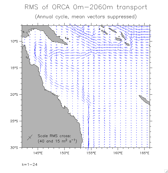
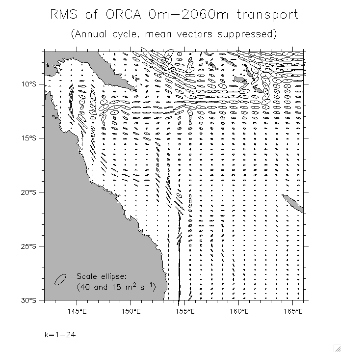
Another approach is to draw the symbols by hand. A somewhat similar
situation is shown in the attached plots below, which are variance
ellipses (or their equivalent in crosses) drawn on a map. These are
one level more complex than your case, because the symbols are
rotated to show direction in addition to varying by size. (see many
more examples at http://www.pmel.noaa.gov/~kessler/noumea/ORCA/
ORCA2.html, including placing the ellipse at the head of each
vector). Your example will be simpler.
My example below used the same symbol (cross) for everything. You
will have the complication of using 2 different symbols for positive
and negative values. Do this by overlaying two plots. Make the first
one with a "+" symbol after masking out the negative values. Then
make the second one with a "-" symbol after masking the positives.
An additional enhancement might be to divide your values into 4
categories: value<-.5, .5<value<0, 0<value<.5, .5<value. Then use
line=1 for the smaller absolute values, and line=7 for the larger
ones (see repeat loop below).
Note that one requirement of the following is that the aspect ratio
of your plot be consistent with the map coordinates (see definition
of DUHI below).
I did these plots by first defining the major and minor axes of each
ellipse, and the angle of rotation (AMAJ,BMIN,THETAM). All of these
are fields in (x,y).
! use the 3rd axis to define the shape (here simple crosses, but any
shape can be made):
let xfact={1,0,0,0,0,-1} ! values to define a generic cross
let yfact={0,0,1,-1,0,0}
define axis/z=1:6:1 zdumax ! dummy z-axis
let zdum=z[gz=zdumax]
let xfactz=reshape(xfact,zdum) ! put the cross on the z-axis
let yfactz=reshape(yfact,zdum)
let xell=amaj*xfactz ! stretch the cross according to the
shape of the variance ellipse
let yell=bmin*yfactz ! in your case the equivalent to
AMAJ,BMIN will be identical, but will contain the size of the cross
! variables XELL,YELL are now 3-dimensional (x,y,z)
! for the second plot you will define a simple horizontal line for
the minus sign .....
! ellipse/cross points in the longitude/latitude frame (rotate by
thetam)
! this will not be necessary if rotation is omitted
let/q xellp = xell*cos(thetam) + yell*cos(thetam-pi/2)
let/q yellp = xell*cos(thetam+pi/2) + yell*cos(thetam)
! above in units of scaled data. Now scale crosses to lat/long
! duhi converts data units to plot inches. It must be consistent for
x and y directions!
define symbol duhi [(map degrees longitude per inch)/(data units per
inch)] ! as in vector scaling
let/q xellpsc = xellp * ($duhi)
let/q yellpsc = yellp * ($duhi)
! place in correct location on map
let/q xx=x[gx=your_xy_var]
let/q yy=y[gy=your_xy_var]
let/q xellmap = xellpsc+xx
let/q yellmap = yellpsc+yy
! make a basemap
go basemap x=[your values]/hli=[your values] y=[your values]/vli=
[your values] 05 lightgray ! choose resolution, here etopo05
! finally draw the crosses
! double repeat loop over i and j
! for each (i,j) location, the variables plotted are functions of z
! I had previously defined the I,J limits and skipvalues as symbols
! might use line=7 for the larger absolute values
repeat/i=($i1):($i2):($xskp) repeat/j=($j1):($j2):($yskp) plot/vs/
line=1/over/nolab xellmap,yellmap
Billy K
On Apr 28, 2006, at 4:03 AM, Emilie Vanvyve wrote:
Hi everyone,
I'm trying to plot as clearly as possible a XY variable ranging
between -1 and 1 let's say, by 0.1 step. The variable is a bit
messy to the extent negative and positive values are next to each
other and no clear separation appears. With a grey scale (no colour
allowed this time), it's impossible to see what is negative, what
is positive.
I'm wondering whether it'll be possible to plot a "+" symbol for
positive values and a "-" symbol for negative values (instead of a
filled gridmesh) and to mimic in the same time the pattern tool by
changing the colour of the "+" and the "-". The closer the values
would be to |1|, the darker the "+" or "-" symbol would be.
I've been playing with palette/pattern combinations, without any
real success so far.
Is it possible to create one's own pattern?
Thanks for any suggestion,
Emilie
______________________________________________________________
Emilie VANVYVE
Physicist, PhD student
Regional climate modelling, Tropical climate
Université catholique de Louvain (UCL)
Institut d'astronomie et de géophysique G. Lemaître (ASTR)
Chemin du Cyclotron, 2, B-1348 Louvain-la-Neuve (Belgium)
Phone: +32 (0)10 473300 Fax: +32 (0)10 474722
E-mail: vanvyve@astr.ucl.ac.be Web: www.astr.ucl.ac.be/u/vanvyve
[Thread Prev][Thread Next][Index]
Dept of Commerce /
NOAA /
OAR /
PMEL /
TMAP
Contact Us | Privacy Policy | Disclaimer | Accessibility Statement